Puma Logo Meaning: A Fast Checklist for Designers
Puma Logo Decoded: What the Symbol Communicates at First Glance
The Puma mark lands fast because it’s built around immediate, universal cues: speed, agility, athletic readiness, precision, and forward momentum. Even without text, the leaping cat reads as performance-driven—powerful and quick without the “bulk” association that some larger animals can imply.
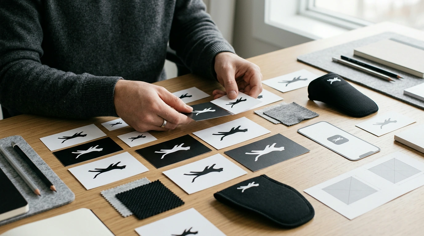
That emotional tone matters in real-world applications. The silhouette feels assertive, competitive, and energetic, but it stays clean enough to live comfortably on shoe tongues, apparel tags, packaging, and digital interfaces without looking noisy or dated. Much of that impact comes down to recognition: the form remains identifiable when it’s small, cropped, or rendered in a single color.
Key Visual Components to Notice (Shape, Posture, and Negative Space)
1) Silhouette-first design
A simplified animal form avoids interior detail so the mark stays legible at small sizes. When a logo can survive being reduced to a tiny stamp (or an app icon), it becomes easier to scale across a full brand system.
2) The leaping posture
The diagonal lift implies acceleration and progress rather than stillness. Diagonals naturally suggest motion; a forward leap also signals intent, not just energy.
3) Negative space control
Clean gaps around legs and tail help the form read quickly on busy backgrounds. This is especially important on patterned fabrics, textured packaging, and action photography—places where weak negative space turns into visual “mush.”
4) Edge rhythm and balance
Smooth curves support the idea of fluid movement, while sharp angles are minimized to avoid visual harshness. The body mass and extended limbs create a stable in-motion composition that doesn’t feel top-heavy—so the mark feels fast without feeling fragile.
Meaning-to-Design Translation: Turning Symbolism into Brand Decisions
Iconic marks are useful because they turn abstract brand promises into concrete design decisions. Use the logo’s symbolism as a filter when choosing shapes, spacing, layout angles, and even how products are photographed.
- If the promise is “performance,” favor streamlined shapes, strong contrast, and dynamic diagonals in supporting graphics (patterns, section dividers, UI accents).
- If the promise is “confidence,” keep marks bold and uncluttered; avoid thin strokes, fussy outlines, or unnecessary decoration that dilutes presence.
- If the promise is “modern,” rely on reduced forms, ample spacing, and a tight color palette with disciplined rules for when accents appear.
- If the promise is “momentum,” echo the leap in system choices: photography direction, layout tilt, motion graphics easing, and headline cadence can all feel “in stride.”
For background on brand ownership and boundaries as you build something distinctive, review the basics of trademark and intellectual property at the USPTO and the WIPO.
The Ultimate Logo Meaning Checklist (Use This for Audits and Redesigns)
Before updating any mark, run a quick audit: what the symbol suggests, how it scales, and how it performs across contexts (print, embroidery, app icons, packaging). This kind of checklist also helps compare concept options without getting stuck in subjective debate.
Puma-Inspired Visual Identity Checklist
| Checkpoint | What to Look For | Quick Test |
|---|---|---|
| Silhouette clarity | Recognizable outline with minimal interior detail | Shrink to 24px—still readable? |
| Motion cue | Diagonal direction, forward energy, dynamic posture | Does it feel like it’s moving even when static? |
| Negative space discipline | Clean gaps that prevent visual “mush” | Place on a busy photo—does it hold up? |
| Balance and weight | No awkward heaviness; stable center of gravity | Rotate 15°—does it still feel intentional? |
| One-color strength | Works in solid black/white without effects | Remove color and gradients—any loss of meaning? |
| Reproducibility | Suitable for stitch, emboss, screen print, favicon | Try embroidery thickness—any parts disappear? |
| System consistency | Supporting graphics match the mark’s energy | Compare icon set, patterns, layouts—same “tempo”? |
| Distinctiveness | Not easily confused with competitors | Show for 2 seconds—can viewers recall it? |
Applying the Lessons: Typography, Color, and Layout That Match the Mark
Typography
Choose fonts with confident geometry and clear counters so the wordmark (or supporting type) doesn’t compete with the symbol’s simplicity. Overly decorative faces can make a fast, modern mark feel slower and less disciplined.
Color
High-contrast pairings increase impact and readability across apparel and digital UI. Consider reserving an accent color for “burst” moments—drops, launches, limited editions, and callouts—so it stays special and systemized rather than random.
Layout and photography
Use diagonals, forward-leading cropping, and asymmetric balance to echo the leap without copying the icon. In photography, emphasize stride, airborne moments, and directional lighting to reinforce speed and athletic focus.
Motion language
For animation, aim for quick easing, sharp starts, and smooth landings. The movement should feel agile rather than heavy—like a controlled sprint, not a slow glide.
For brand context and company background, see PUMA SE — Company Profile.
Common Pitfalls When Borrowing Inspiration from Iconic Marks
A Ready-to-Use Worksheet for Brand Reviews and Creative Briefs
Shop Related Guides & Checklists
- Puma Logo Decoded – The Ultimate Puma Logo Meaning Checklist for Branding, Design Inspiration & Visual Identity Strategy (Digital download)
- Nike Minimalist Sneaker Outfits Guide – Modern Capsule Wardrobe Styling eBook & Checklist for Effortless Everyday Looks
- Purposeful Progress: How to Set Goals with Kaizen & Ikigai | Goal Setting eBook, Self-Improvement Guide, Digital Download for Personal Growth
FAQ
What does the Puma logo symbolize?
It’s commonly associated with speed, agility, power, and forward motion. The leaping posture reinforces performance and momentum because it visually suggests acceleration rather than rest.
How can designers use iconic logos for inspiration without copying?
Borrow the transferable principles—silhouette clarity, negative space discipline, motion cues, and scalability—while developing an original concept, proportions, and posture. Running originality checks and iterating away from “look-alikes” keeps the work distinctive.
What makes a logo work well on shoes and apparel?
Strong one-color performance, clean shapes that survive stitching and small-size printing, and clear space rules are key. High contrast on varied materials (leather, mesh, rubber, fabric) helps the mark stay readable across real products.












Leave a comment